

UX / UI
Design System
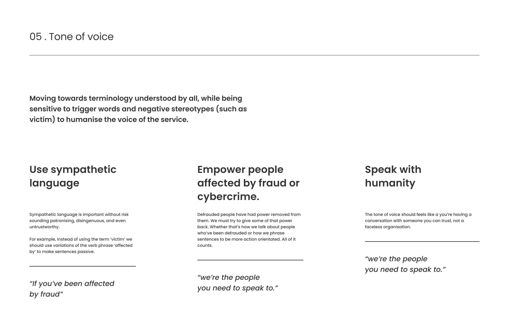
Brand
Storyboard
About The Client
Action Fraud is the UK’s national reporting centre for fraud and cybercrime.
The service is run by the City of London Police working alongside the National Fraud Intelligence Bureau (NFIB).
The Requirements
To lead the UI design deliverables, starting with design research and concepts to developing the visual components and pages from different user flows of the UX while simultaneously building up the design system.
Action Fraud Service introduction
Discovery & Research
Research highlights
Understanding our users
Our Research team pointed out that to define our design solution it was crucial to learn about “Trauma Informed Design”.
Given the emotional states of our users (cyber-crime reporting victims), there is both a duty and an opportunity to provide with support. While victims can be assessed for vulnerability and signposted to support services, all reporting victims could benefit from an approach that communicates with empathy, for this, we can follow some principles from Trauma Informed Design.
Note: Many of the design practices found in Trauma Informed Design case studies are familiar in a human-centred design approach, but TID emphasised key feelings for users that should be fundamental to the entire experience.
How TID principles can manifest in practice?
Reduce Friction
User may feel a range of negative emotions, we need to ensure they know what is the next thing every step of the way, to minimise the potential for error, and provide clear guidance for correcting errors whenever they are made.
Provide Safety
Victims may feel threats from the repercussions of financial indebtedness or fear of secondary frauds. We should reassure victims, and provide avenues for support, people need to feel safe using the service.
Communicate Hope
Victims may be hopeful of resolution, but this cannot always be assured. With the severity of the consequences of victimhood, the service should also consider ways of instilling hope that these issues can be overcome.
Give Empowerment
Many victims blame themselves. We need to communicate that they are not at fault, while also giving ways in which they may take precautions in the future, to give them a renewed sense of control.
Screenshots from the research documentation I created for the team and the client.


Refreshing Accessibility Principles
We researched the accessibility standards WCAG2.1 and the government Service Manual, to ensure our design solution meets our user needs.
Improving the website’s accessibility can enhance its usability for all users, including those with impaired vision or hearing, cognitive impairments, motor impairments or situational disabilities.
Here is an overview of the principles that we followed or consider to guide our visual and experience design solution.
In addition, we conducted an audit of the current site to identify opportunities for improvement.


Strategy & Concepts
Creative directions
Two creative directions were explored, “Modern” and “Utilitarian”, built on top of our discovery insights and research into Accessibility and Trauma-informed design. These design directions convey different approaches to the same solution challenge, to convey the proposals for the future state vision of the Action Fraud service.


Early design concepts
Our concepts were the core vision driving the design of the website, a result of our early research, current site, new tone of voice and new brand presence. This help us not only to kick off the design phase but also to align our vision with the client.


screenshots
Building up design system-friendly UI components and documentation.

“Anyone who has worked on government contracts can appreciate the challenges of creating a modern, creative style while remaining on the right side of compliance. Fede took to the challenge in the right way, balancing his personal design sensibilities, the clients brand and direction, while remaining focused on the needs of the end user. The result have impressed the client, and pushed the boundaries in what is possible.”
Conclusion
All design assets built in Figma were handover to the in-house design/dev team, design iterations will continue based on the usability testing and the AF site will be published around March 2023.
Design Team
Sr Product designer
Fede Casabona
Lead UI/UX Designer
Tony Kerchhoff
UX Writer
Toby Cryne
Behavioural Science and Human-Centred Design